Streamgraphs
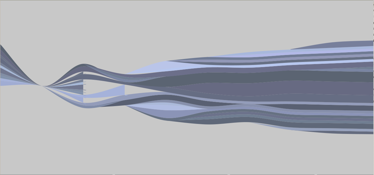
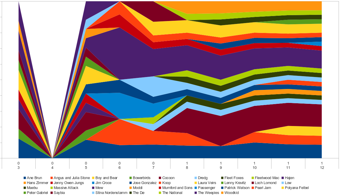
A bit more of tech-babbling. When I tried to create the overview about the music I was listening to in 2011, I had a certain type of graphs in mind I have seen earlier on last.fm. If you have an account there and listen to streaming music they create an overview about all the artists in a stacked graph for you. Whenever you want you can print it out (or let it be printed out) and let them send it to you as a wall-poster. I especially liked the design and so I wondered how I could get my data in that kind of shape…
My first attempt was using LibreOffice and the stacked graphs in there. It worked, but was not looking very nice. The rounded curves were missing and the default color-set was terrible, it was very accurate though. But still. Being not happy with that solution I found Streamgraph. A program written by Lee Byron (and a paper about it as well) and a transport to JavaScript. And it’s interactive. Do we like that? Yes, we do!
When creating the data-pool I’ve first set up an data-array like in the data-sheet I’ve used before:
artist1:valuea1;valuea2;valuea3;...
artist2:valueb1;valueb2;valueb3;...
But as a source you’ll actually need something like this:
valuea1;valueb1;...
valuea2;valueb2;...
valuea3;valueb3;...
The artist are defined anyway in a second one-dimensional array. The included help-file provides enough details. Just keep in mind that the number of artists must be identical to the entries in each array-row, not the to the columns.
Basically everything wasn’t that difficult as soon as you’ve figured out what and how the authors meant it to be used (as usual, ok, maybe sendmail is an exception here).
When you’re trying it out you might run into another issue. I had to copy the test-files into the http-directory of a local web-server to make it work. It looks like neither Firefox nor Opera was excepting the files and the JS-Code unless it was provided from a web-server - even a local host will do.